Every time I finish an artwork, I feel like it’s the BEST THING I've ever done and I marvel at what I have created. Over time though, as I improve my skills and aesthetic, this definition of the best-thing-ever changes. I don't remain the same artist as the years go by and I look forward to seeing how my artistic sensibilities change over time.
Which is why I like redrawing my old artworks. It presents me with an opportunity to see where I have improved and whether I would make the same decisions when it comes to colour and composition or even more abstract things like mood or feeling.
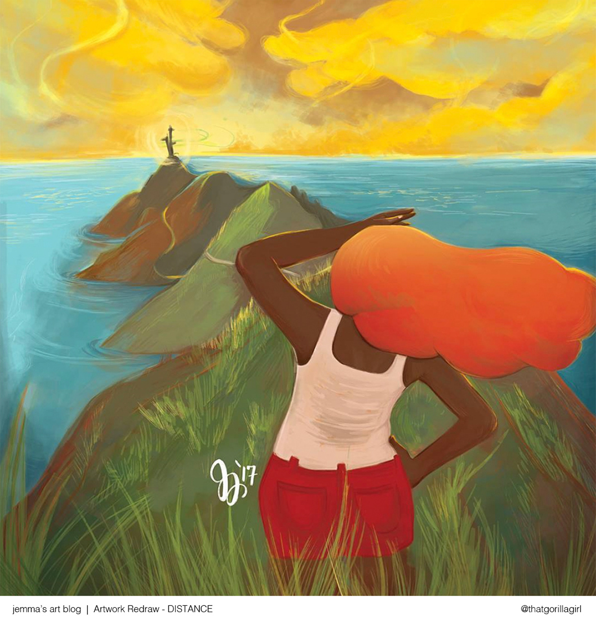
Below is an illustration I made in 2017, one that I thought was the highlight of my portfolio that year. Looking at it now, I have a few...ahem...notes. I’m going to redraw it using what I have learned over the last four years and by the end of this post you’ll see a new and hopefully better version of it.
First thoughts:
- No focal point in the image: Should the focus be on the girl or the tower in the distance? Between the even saturation of the colours, the sameness of the details everywhere and the flat lighting, my focus is being pulled in every direction so, the point of interest is not clear.
- Colours: I was going for a super bright colour palette and wanted it to be BAM! right in your face. But without much contrast i.e. having areas with less saturation, the illustration ends up looking flat, no matter how bold the colours.
- Composition: Right off the bat I can tell that the perspective can be improved. I am not very good with backgrounds so I did whatever came to mind here, but I could have studied a few photos of a seaside cliff while sketching it out.
- Lighting: This is another aspect of illustration I have always struggled with, and I've realised that lighting is crucial if you want to elevate your artwork. This insecurity about my skills had gotten the better of me back then and I painted what I thought looked ok. As a result, all the shadows look the same and the colours feel as if they are on the same plane. There is no real differentiation between foreground, middle ground and background. This was not what I was going for; I wanted the illustration to convey distance and some kind of hopeful longing and distance so, it falls short of the goal I had in mind.
- Details: I hadn’t put much thought into the character, the clothes or the surroundings and even though this was personal work which needn't be in-depth or intense, a little more thought into such details would have made it a more interesting piece. Looking at it now, I don’t really understand her outfit or hair colour and the rendering of the clothes and grass makes her look flat and dimensionless.
Corrections
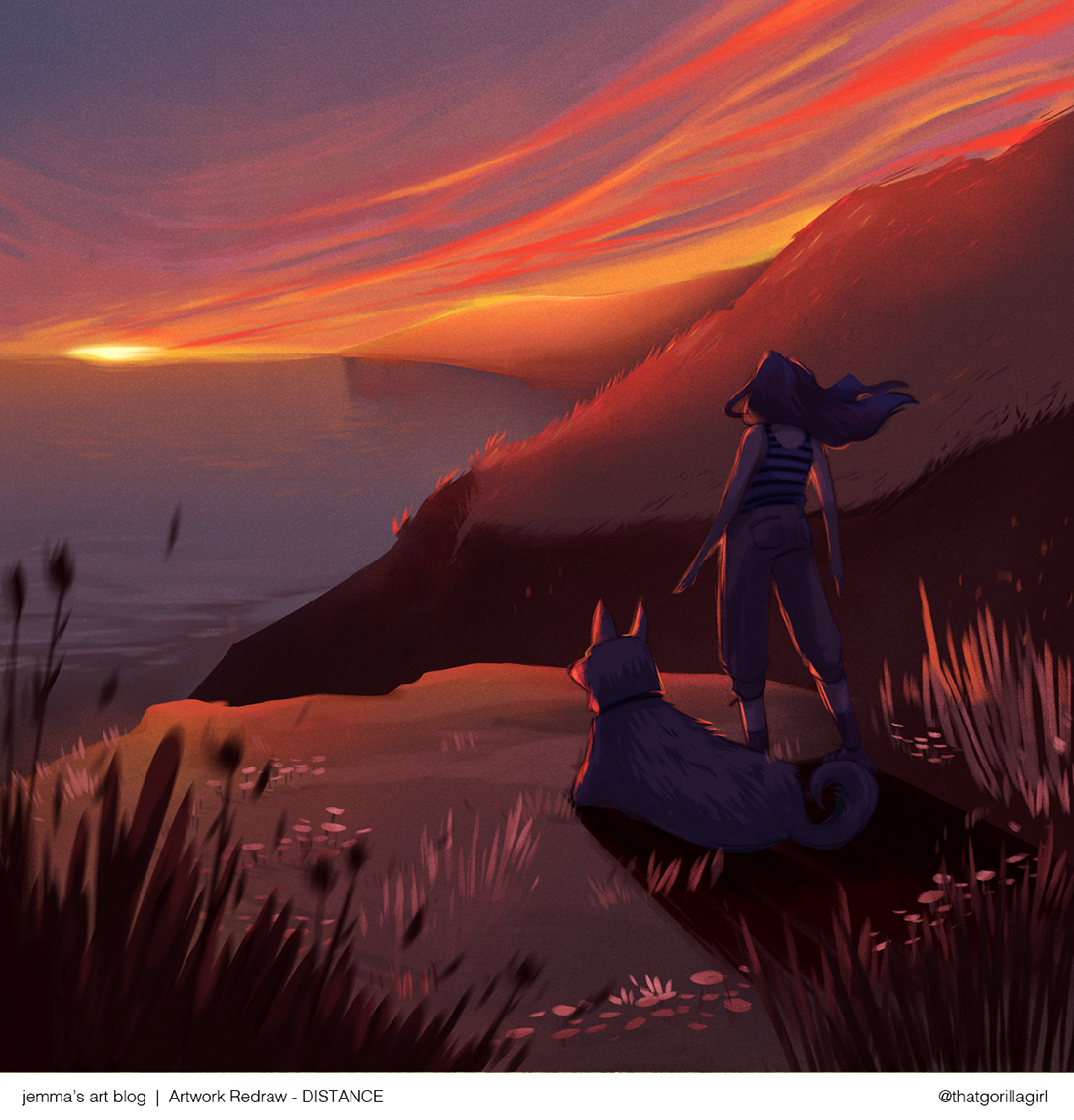
For majority of my digital art, I use Photoshop CC. I place the original drawing on a layer and lower the opacity and on a new layer, I start making corrections to the perspective and main character while adding a few deliberate bits of interest — like a dog companion and a light beam at the horizon. I keep few reference images on my canvas while I draw. They are a mix of photos and artworks that I feel convey the same sense of scale and mood as what I'm trying to capture. You may have heard this from plenty of other artists but it bears repeating, using references is TOTALLY FINE :)
For majority of my digital art, I use Photoshop CC. I place the original drawing on a layer and lower the opacity and on a new layer, I start making corrections to the perspective and main character while adding a few deliberate bits of interest — like a dog companion and a light beam at the horizon. I keep few reference images on my canvas while I draw. They are a mix of photos and artworks that I feel convey the same sense of scale and mood as what I'm trying to capture. You may have heard this from plenty of other artists but it bears repeating, using references is TOTALLY FINE :)
Colour
Not gonna lie, the colour palette for this artwork took me a while to figure out. Again, it helped to look at photos of this kind of landscape and time of day, so I could study the lighting and see how colours interact with each other. Here are few photos I collected from Pinterest and Instagram:
Below are some rough colour options I tried out. I realised that the original colour palette wasn't as appealing as I had imagined so, I tried out some totally different options as well:
The option below is the one I liked the most and the colours were picked from the reference photo next to it:
Paint, paint, paint
Now, it's just a matter of painting. I put on a good playlist, make sure my water bottle is full and go for it. This illustration took me about 5.5 hours to complete, and finished over two weeks.
Here's a time lapse of the painting process, set to nice, chill-vibes music:
Here's a time lapse of the painting process, set to nice, chill-vibes music:
Resources
Constant practice and learning is the key to becoming a better artist. I believe that as your portfolio improves, so do your chances of getting better projects. I set new goals for my skillset every couple of months but, there is no way I can do it by myself or in a vacuum. Thankfully, we live in a wonderful age where we have access to tons of great classes and tutorials online!
Here are two resources that helped me a lot with this artwork:
• Lighting Principles for Digital Painting by Samuel Smith: A super comprehensive course available on Domestika taught by Sam Smith, who is a visual development artist for animation. This course is so eye-opening! Sam is a great teacher and he explains concepts very thoroughly and it's guaranteed to teach you how to add depth to your artwork.
I highly recommend that you buy the course and devour it as many times as necessary because in addition to his excellent lectures, he references other amazing artists and tutorials throughout the course that will, no doubt, add to your knowledge.
• Laura Price youtube channel: I dunno how I came across her channel on Youtube but it's one of those rare instances where I am grateful for the algorithm for pointing me to her work! Laura Price is an amazing background painter and visual development artist in the animation industry and her art has inspired me to step out of my comfort zone and do more backgrounds.
Here are a few videos that helped me understand how to paint backgrounds as a beginner. Her explanations are short yet insightful and her voice-overs incredibly fun! Check out her other vlogs and tutorials too. She's AMAZING!!
Here are a few videos that helped me understand how to paint backgrounds as a beginner. Her explanations are short yet insightful and her voice-overs incredibly fun! Check out her other vlogs and tutorials too. She's AMAZING!!
Before and after
Who doesn't like a good transformation? I am extremely pleased with how this redraw turned out! Using a restrained colour palette is not something I do very often yet, the artwork has more oomph! With fewer, well-chosen colours, I certainly feel that the mood I was trying to capture comes through more clearly in the newer one. Hope you found this post helpful!
Who doesn't like a good transformation? I am extremely pleased with how this redraw turned out! Using a restrained colour palette is not something I do very often yet, the artwork has more oomph! With fewer, well-chosen colours, I certainly feel that the mood I was trying to capture comes through more clearly in the newer one. Hope you found this post helpful!


